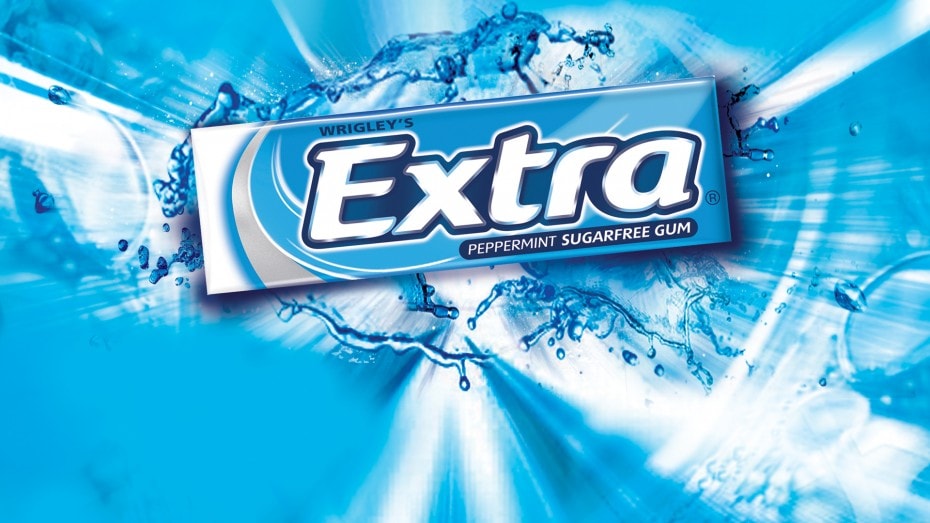
Wrigley’s Extra Gum – Branding and packaging design.
The Brief.
As the country’s 2nd largest confectionery brand worth £150m, it took the threat of a new deep-pocketed competitor (Trident) to issue the ultimate design challenge. With a tiny visual canvas and a huge, slightly dysfunctional product range, we sharpened our pencils to demonstrate how to beef up the impact and establish a brand architecture based on the ‘Breath of Fresh Air’ positioning
Branding / Packaging Design /

The Approach.
It’s normal for big brands to be nervous of change. It takes guts to challenge well-known brand equity. The old-fashioned serifed logotype evolved to a more contemporary presentation, backed with a newly-consistent dark blue background to max the shelf-shout. A sweep brought in the fresh air and became the mechanic to differentiate the range. We then rolled out to all the formats.

The Result.
The roll-out included NPD, point of sale and brand guidelines adding some much needed punch to these little packs.
The result? In a static market, Extra grows +6% and Trident declines -41% to £8m in 2011.

What they said.
“Thank you for all your great work this year. You revolutionized our designs with Ice, then Fusion and finally the overall Extra brand identity. What an amazing year”
I.T. Senior Marketing Manager, Wrigley