Pure Maple Syrup – Branding & packaging design.
The Brief.
Pure Maple tasked us with repositioning their syrup brand and packaging design to reflect their deep Canadian roots and emphasise their newly certified organic status.
The goal was to create a design that resonated with UK consumers, communicating the purity and sustainability of the product. Also to celebrate the brand’s heritage and the uniqueness of their maple syrup.
Branding / Brand Logo / Packaging Design / Illustration / Copywriting
The Strategy.
Many maple syrup brands rely on traditional, almost pastiche Canadian imagery.
Our design strategy was to break away from this convention and create a fresh, modern look that reflects the Canada of today, a country dedicated to environmental responsibility, purity, and sustainability.
By embracing a more contemporary approach we positioned Pure Maple as a brand that is premium, authentic, and forward-thinking.
The Big Idea.
We wanted to invite the consumer into the pristine, untouched beauty of Canada’s wilderness but in a less traditional way mirroring the unparalleled purity of the maple syrup itself.
Focusing on the sap’s journey, we crafted a visual narrative that celebrates the natural process of tapping maple trees from the spring harvest to the bottle.
This storytelling approach connects the product to its origins offering consumers an engaging experience.

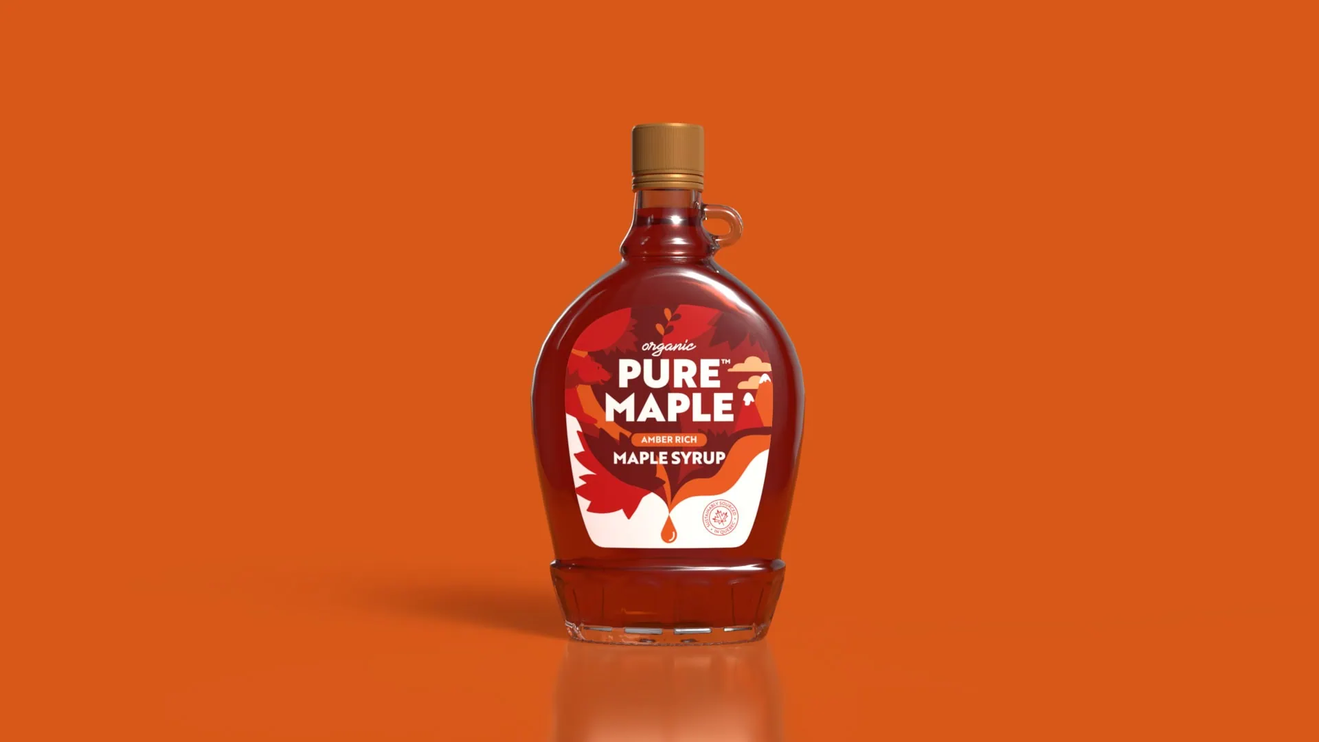
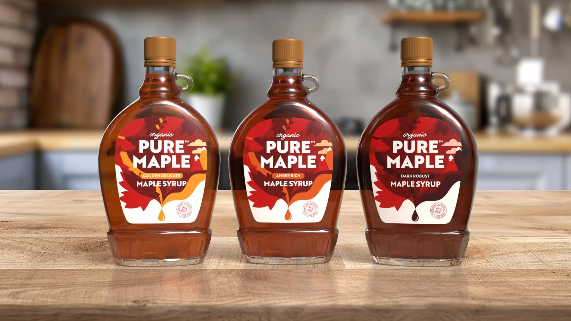
The Result.
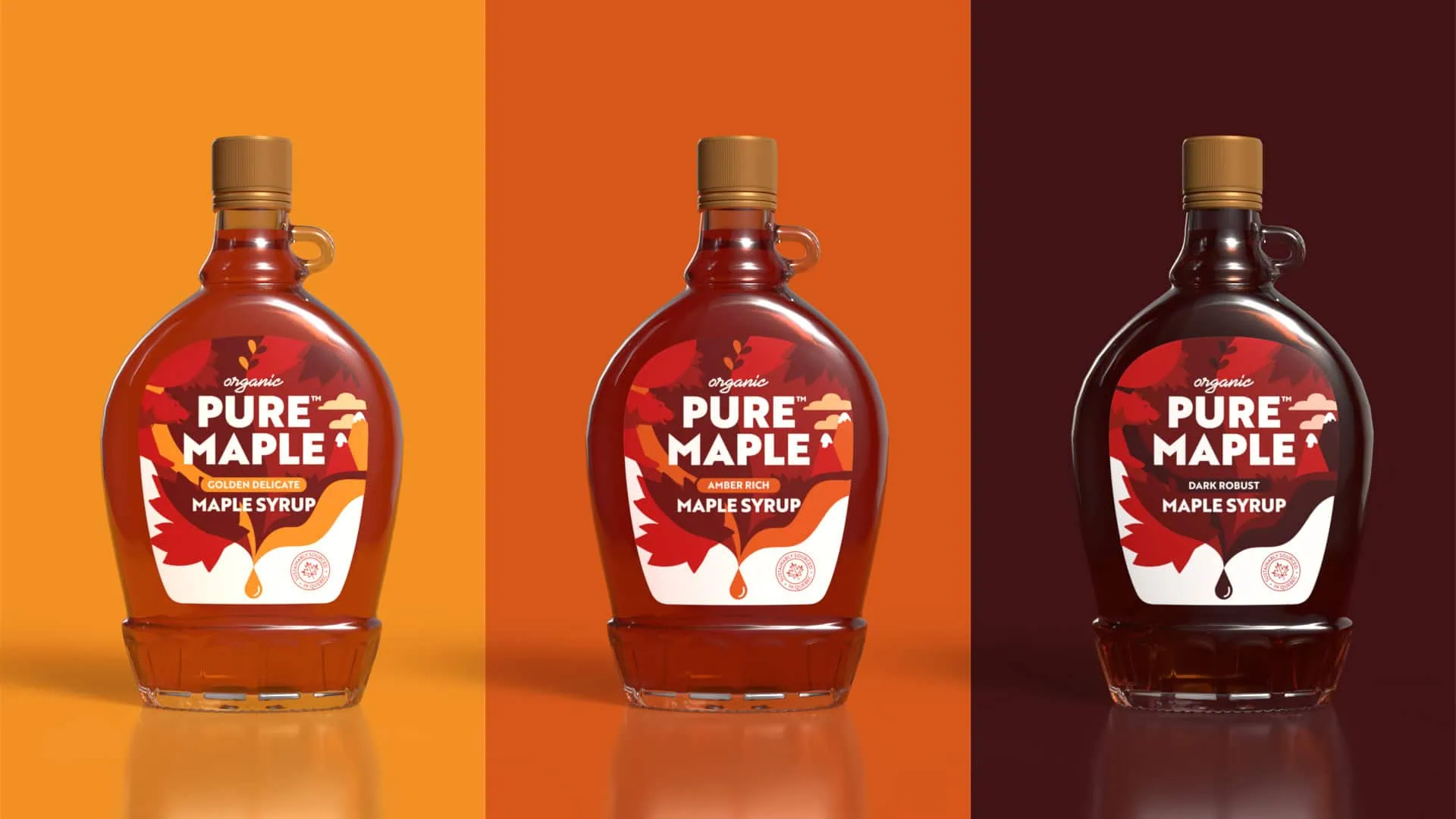
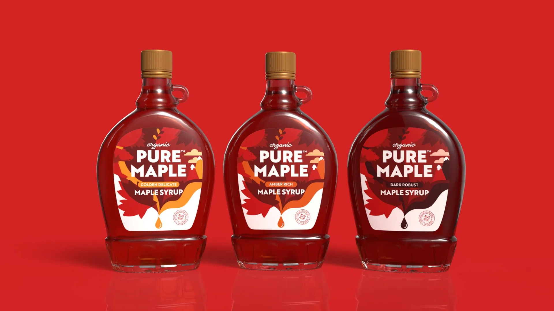
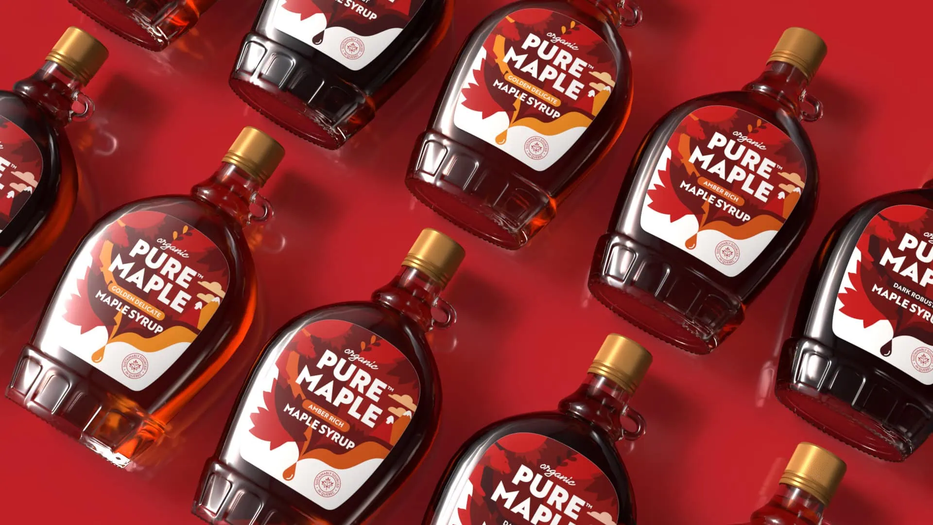
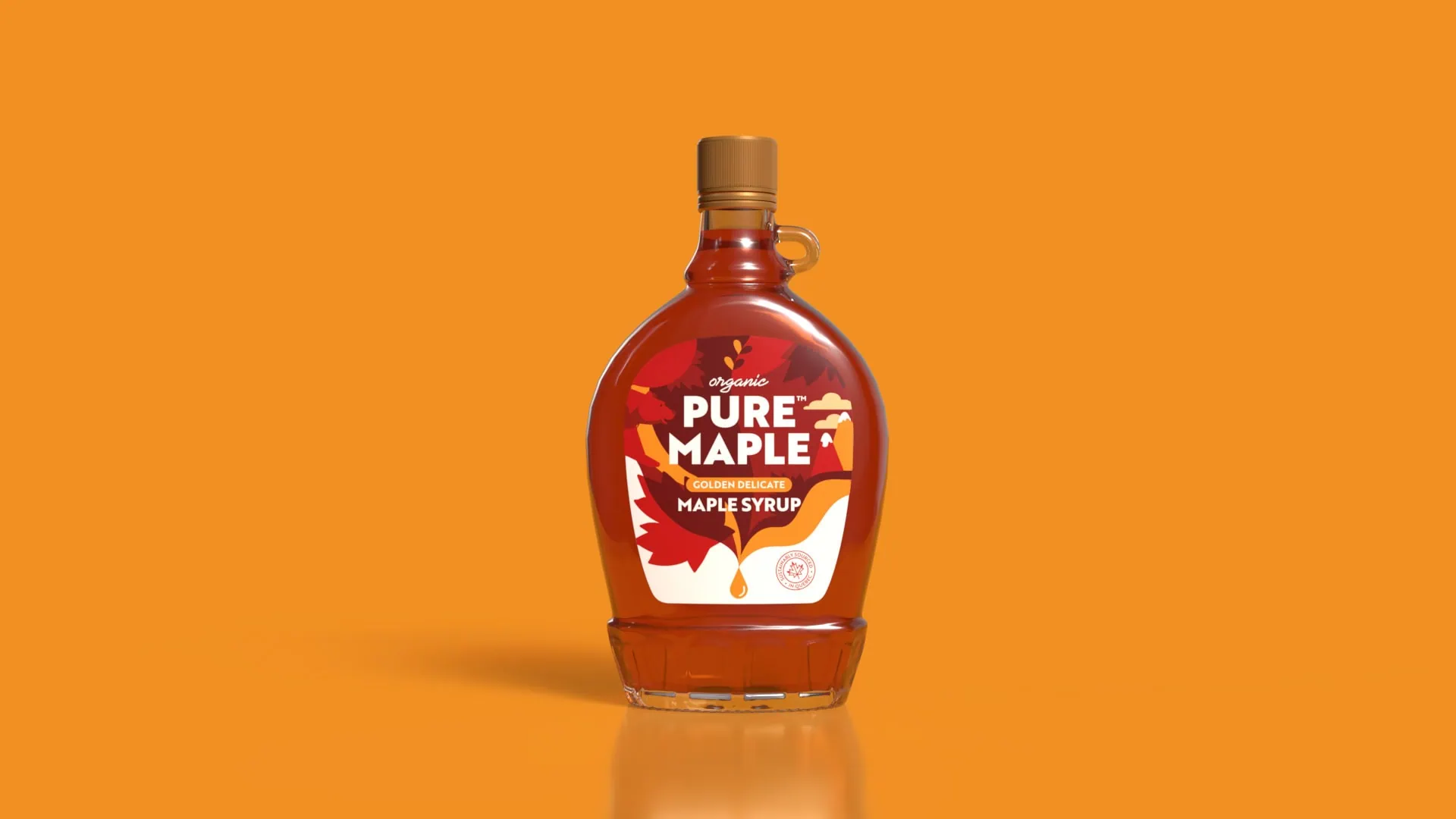
Our new packaging design was rolled out across 3 variants: Amber Rich, Dark Robust and Golden Delicate.
The range uses a bold visual language that underscores our deep respect for nature and drives home the ‘pure’ promise at the heart of this brand.
What The Client Said.
“We are absolutely thrilled with Slice Design’s exceptional work on our new packaging identity.
They have truly captured the essence of our Canadian heritage while bringing a fresh, modern feel to our brand.
The thoughtful design not only enhances the authenticity of our syrup but also beautifully conveys the story behind every drop – from the maple trees of Quebec to tables across the UK.
The attention to detail, sustainability focus, and striking visuals ensure that Pure Maple stands out while staying true to its roots.
A fantastic collaboration—we couldn’t be happier with the results!”
Rob Ward – Founder Puremaplers Ltd