
Lixir Tonic – Branding and packaging design.
The brief.
We were briefed to create the packaging for a new range of premium tonic water for two friends and entrepreneurs, Matt and Jordan.
The brief was to create a range of packaging that is gender neutral to appeal to a mass market. It was also important that we communicated the unique flavours made from natural extracts and no artificial ingredients
Branding / Packaging Design / Naming


Our Approach.
During a stage of Brand Positioning we identified that this product is “More than just a mixer”. Lixir is perfect for any occasion as well as any drink. The unique flavours can be mixed with anything from wine, rum, vodka to fruit juice or simply enjoyed on its own.
The Result.
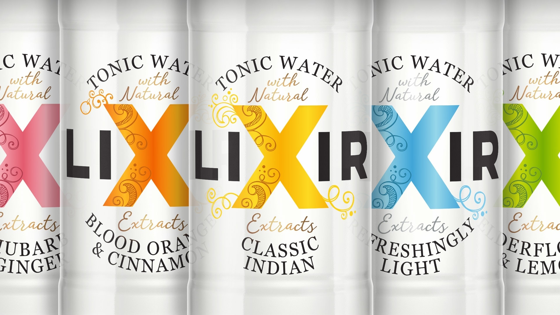
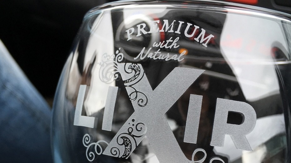
Lixir, a play of the word Elixir, is a range of new and exciting flavour tonic waters made from natural extracts with no artificial colours so it was important to have clear bottles and transparent labels.
The ‘X’ cleverly plays on the suggestion of a ‘secret ingredient’ and is a strong band beacon for shelf stand-out.
The delicate swirl illustrations represent the fusion of the unique flavours. This understated design perfectly positions Lixir as a unique and premium brand.

What The Client said.
“Working with Slice was a complete pleasure, from the first piece of artwork to our final designs. Although a start-up we never felt any less valued as a client. Response time was swift, plans and objectives clear and all our work met to the required deadlines. Slice has created a truly stand out brand for us and this quality of work will inevitably see us working together again in the future!”
Matt Mahatme – Co Founder – Lixir Tonic Water