Using Colour In Branding
This week we will be looking at the use of colour in branding. Below we discuss 4 topics from reproduction to finishes. First up, owning a brand colour..
1. Owning a brand colour
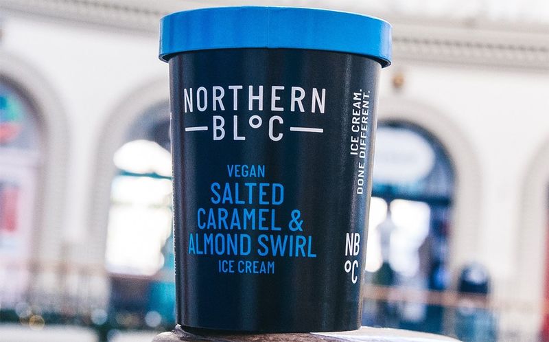
Using colour as a visual shortcut to brand recognition is one of the most powerful tools in your arsenal. If I was to say name me a ‘red’ or ‘purple’ brand, the chances are you could answer pretty quickly.
If you have a large amount of SKUs or a broad portfolio, a consistent brand colour is a great way to own the shelf.
Whilst it’s difficult to own a colour outright, it’s a lot easier to own a colour within a particular sector. Take for example Colgate and Coca-Cola.
Both use a similar hue of red but because they operate in different sectors that clash becomes less apparent.
If you want to stand out however it’s difficult to be associated with a particular colour that is intrinsically linked to another brand. In these instances it’s useful to look at linking colour combinations that are distinct when used together.
A great example here is IKEA. These brand assets are managed so that the proportions of one colour versus the other are always used consistently so re-enforcing brand recognition.
These colours could either harmonise or as in the case of IKEA, create a stark contrast for increased standout. 
There are many different hues of each base colour. Darker hues of blue for example are used to convey trust where brighter and more vivid shades convey optimism and refreshment.
There are no fixed and fast rules however. It may be that the choice brand colour is used to flex a different aspect of your brand values. All banks for example, want to convey trust but clearly they can’t all borrow from a dark blue pallete as that would create confusion.
2. Colour reproduction at print
It’s always rewarding seeing your pack printed in beautiful vivid colours.
Sometimes however it’s not always possible to replicate the design as it was intended because of how it is going to be printed. 
I’ve noticed recently that some clients are preferring to move from traditional six station print jobs (using Pantones) to cheaper CMYK runs. Especially on pack outers or secondary packs. The benefit of price is obvious (especially in the current climate) but there is also invariably a sacrifice of quality.
Some Pantone colours are easy to replicate in CMYK where others are more difficult. Greens and oranges can be tricky as their equivalents tend to go quite muted and dirty.
Not ideal if this is your brand colour!
The reason that this print method is cheaper is not just because there are fewer printing stations but also, printers can double up or piggyback runs with other jobs on similar substrates.
This piggybacking can create other headaches. If colours need to be tweaked to benefit one part of the job, they will invariably affect other parts.

3. Finishes and effects
So, we have looked at owning a brand colour and how we ensure this is replicated consistently at print.
The other aspect to cover is what this is being printed on and the effect that can have overall. 
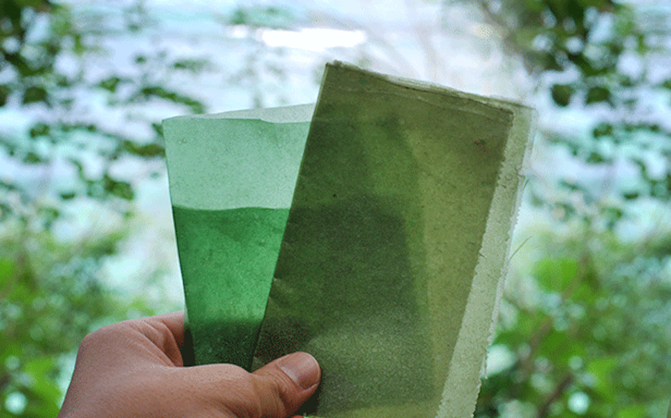
Printing onto a matte white substrate will create a completely different feel then printing the same colour on a shiny metallic surface.
You can see in the image below. A print test we did using a flavour colour at different tints with different backings of white on metallic substrate.
Similarly, printing onto a plastic pouch is going to have a different look and feel to printing on cartonboard.
This can cause issues of consistency on brands and products with large portfolios that span different packaging formats.
This is especially true when printing in CMYK as discussed earlier..
Getting the printer to supply a proof or creating a target proof for the printer to match to, is hugely important in these instances so that runs can be tweaked before the big green button is pressed!
That said, always expect a little variation based on the end canvas you are printing on.
4. Help! I’ve run out of colours!
Often, and this is especially true of large portfolios of products. You simply run out of available colours on which to differentiate the flavours!
Whilst there are hundreds of different hues of each colour, our ability to differentiate between these is not as broad and expensive as the wealth of options we have available in a Pantone book!
Say you have one flavour that strawberry and one raspberry, clearly both of these require the use of red. It is important to make sure these colours hues are clearly differentiated and far enough apart so as to not cause confusion. 
Keeping these hues distinct means none of the colours between these two hues can be utilised elsewhere in the portfolio. Without some further differentiation on pack or through the product.
There may be instances where the entire portfolio uses a white out logo. Furthermore white out copy from a darker colour background. This is great because you get lots of punch at fixture.
When those deeper colours run out and you only have lighter colours left it can be difficult to maintain the same consistency . Furthermore the legibility by using white out logos on top of these lighter colours, without changing or challenging this consistency slightly.
If you are looking for some advice on your brand colour system, or think that you could benefit from a quick brand health check, then get in touch for an informal chat.
Using Colour In Branding Read More »