
I’m not a fan of following trends in graphic design. For me I think design should answer the brief rather than the current fashion trend.
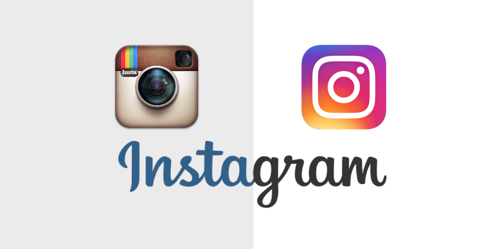
Take the new Instagram logo for example. Gone is the reference to the old Polaroid/Instamatic camera. That icon of capturing the 1970s moment and in comes a flat, monolithic, uninspirational piece of iconography that fails to capture the essence of the brand but is following the current ‘trend’.
The beauty of the old logo is it symbolised that perfect moment; from a time when every shot counted. When photos were precious memories and something to be cherished (rather than a complete documentation of your evening!)
Shouldn’t that be at the core of Instagram’s brand message and communication? I think so.
Now it’s been a while since the logo change that causes so much controversy what are your thoughts?
Based in London UK, Slice Design are a top international creative branding and packaging design agency that have helped consumer brands grow and get noticed since 2004. We like to think of ourselves as a challenger to the large agency. As the name suggests we cut through jargon with our flexible, no nonsense approach and down to earth attitude.
No fancy trademarked processes and no hidden extras. The benefit to yourselves is all the experience but with the flexibility that large packaging design agencies cannot deliver.
From our studio in Hammersmith, London, we work for clients around the world: global and local, big household names and small startups, challengers and leaders. Whether a big brand re-design, NPD launch or simple packaging updates. We’re proud to remain flexible, refreshingly honest and wholly independent.
You can see some of our recent packaging design work here