Following our previous post “New Survey reveals “simplest” Brands”, we have looked at brands who have followed this trend and opted for a more simplistic logo design.
All new brand logos on the right…
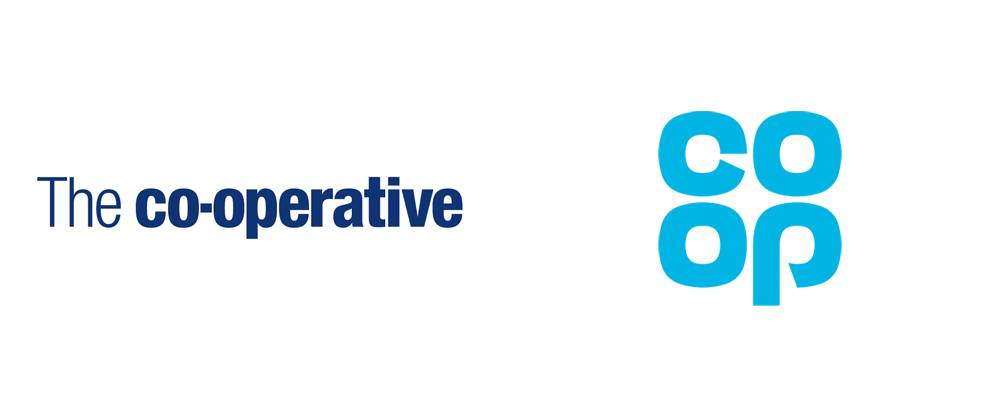
1. Co-op
In 2016, Co-Op reverted back to their roots by modernising a version of their 1968 cloverleaf logo.
Co-op group design director Ben Terrett says:
“With the new membership offer our own brand products become more important than ever and this new look brings a simplicity and helps them stand out more.We want all our products and services to be simple and user focused and this is an essential part of that work.”
2. Kodak
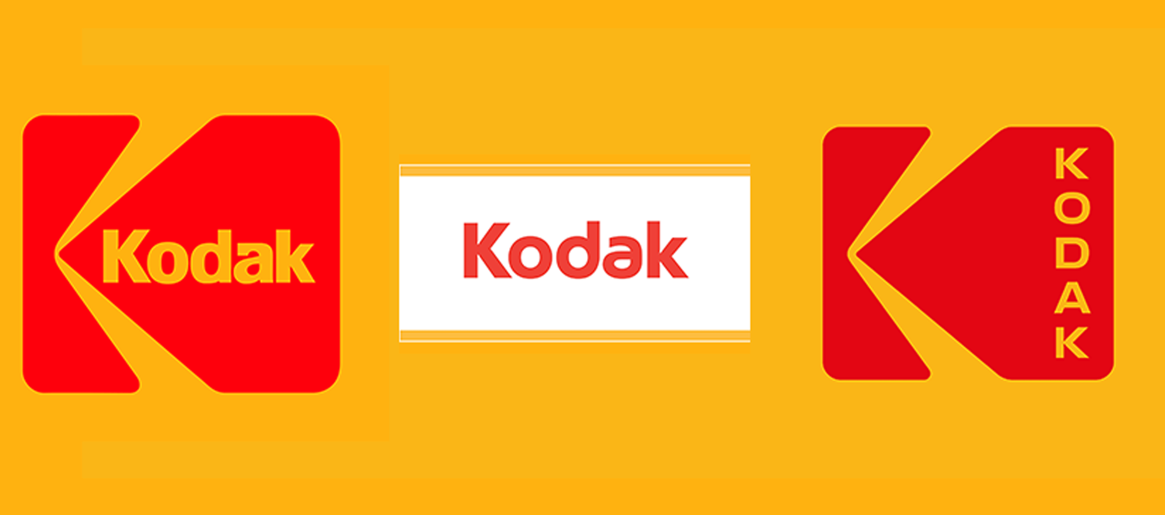
Kodak also took a step back to their past by re-designing their logo which mirrored their classic logo used between 1971 and 2006.
3. Deliveroo
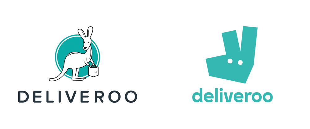
Deliveroo’s new logo includes a more simplistic character turned into a bold icon for impact. See their redesign story here.
4. Mastercard
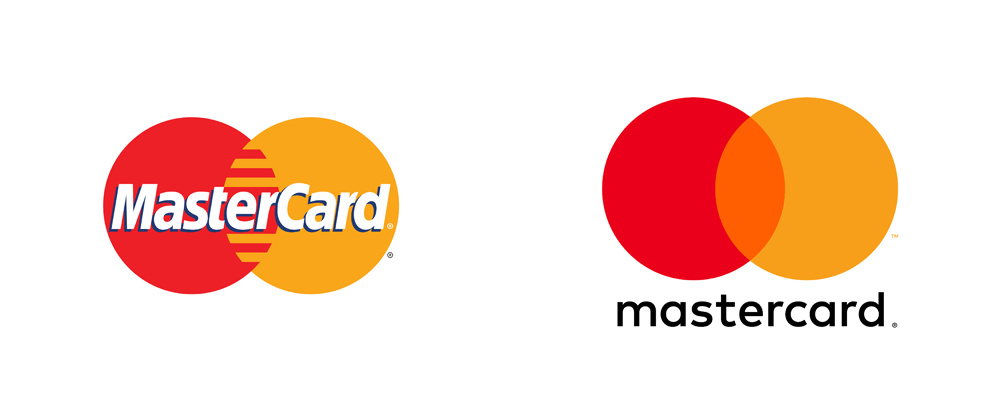
Mastercard have also taken a cleaner approach re-branding and for the first time in 20 years re-designed a new logo.
Whilst the logo has been stripped back to its core, research conducted by Mastercard following the rebrand found that more than 80% of consumers still recognised the symbol without inclusion of the name.
5. Gumtree
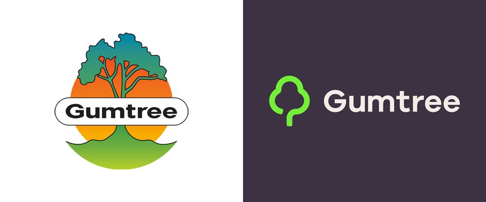
The new Gumtree logo reduces a lot of clutter which the previous logo had. This new simplistic approach will hopefully convey to customers how seamless their service is.
6. Instagram
Now for the one that caused the most controversy. The retro looking camera icon was replaced with a colourful, simpler logo that wasn’t liked by many. Slice Design’s Director, Alan Gilbody, discussed his views in the blog post “Following the herd” which you can read here.
A spokesman for Instagram said: “We’ve been inspired by all the ways the community has grown and changed, and we wanted to create something that reflects how vibrant and diverse storytelling on Instagram has become”

What do you think of these more simplistic logos? We’d love for you to tell us below.
Based in London UK, Slice Design are a top international creative branding and packaging design agency that have helped consumer brands grow and get noticed since 2004. We like to think of ourselves as a challenger to the large agency. As the name suggests we cut through jargon with our flexible, no nonsense approach and down to earth attitude. You can see some of our recent packaging design work here.
