How do you ensure your brand stands out on shelf?
When designing packing, it is important to not just make sure it looks good on it’s own, but also when set against your competitors. That’s why at Slice, we regularly look at shelf shots for our clients as it’s important to envisage how the final pack will work at shelf.
Below we’ve collated our top 5 tips to ensure shelf standout. Enjoy!
1. Utilise your packaging
Think ahead to when the pack will be on shelf, how will it look with the rest of the range? Techniques such as shelf blocking through the use of strong brand colours and details, creates a compelling visual to lure consumers towards the brand to discover more.
Boddingtons have ensured a compelling identity on shelf by using the B (and bee) on their outer packaging (as long as people stack it the right way)

Alpen are also a brand who make sure they make their mark on shelf due to their letters joining up from the n to the A. When stacked next to each other there is a fluidity across packs, making the brand name stand out very well – great for instant recognition amongst shoppers.
2. Dare to be different
Now this could be a scary one to some people, but sometimes it pays off to be different. It’s a chance to disrupt the shelf through either colour, imagery or specific print techniques.
If this is too risky for you, why not try dipping your toe into the water with a limited edition pack and see how the reaction to it is?
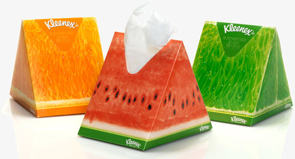
Take Kleenex for example who come out with bold new editions that really make an impact. Oxo also make a statement by using letters across their packs to spell out their brand name on shelf. Certainly grabs the eye of a shopper!

3. Be clear on shelf
When a customer is looking for products, the last thing they want to be doing is having to search the pack for claims or benefits – especially in a supermarket. Having these clearly displayed on the front of pack or SRP makes it simple for the customer to know exactly what they are getting and they are therefore much more likely to pick up your product.
We’re not saying load the front of pack full of claims – as no-one has the time to go through that! Be selective and pick the best attributes of your product to emphasise.
Take Cilit Bang for example, when we designed their pack we created icons so it would clearly and concisely explain the use of the product. Clover also display the benefits of each of their products on the corresponding SRP – making for easy navigation per range.

4. Be smart
Don’t be single minded when it comes to pack design. What else could you do with it?
Is there an opportunity to also educate your consumer as we did for Aquafresh? Through iconography, simple and effective brand architecture and navigation, educating and guiding the consumer to purchase and beyond, ensures quick decision making and trust in simplicity.
Could the packaging be multi functional and turn into something else after you’ve used it, maybe to aid the product?
Or could it be environmentally friendly to backup your brand proposition? Enabling your packaging to take up less space or perform better through the use of less, is an aspect that is continuously becoming of concern and importance for consumers.
Duracell have been very clever with their point of sale in ensuring they utilise their brand equity. There’s no mistaking what that is!

5. Don’t forget shelf ready packaging & POS
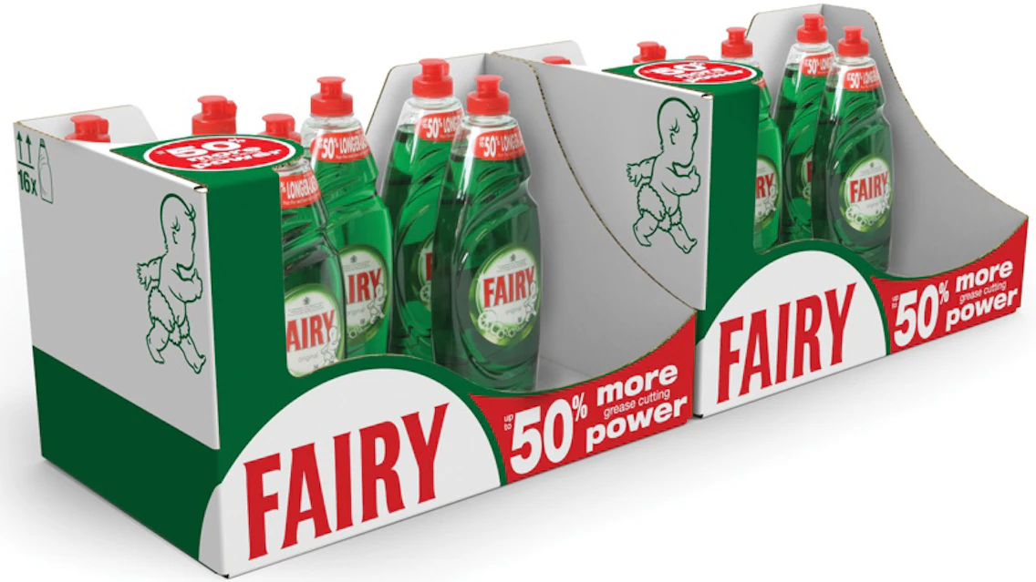
And lastly, do not forget SRP’s and POS! This is very important as sometimes it’s an afterthought, taking a back seat to pack design. Once your product is on shelf, it’s main purpose is to sell and your product will only sell if people pick it up. An SRP can display information that isn’t on the front of pack or claims that you want to shout about.
Take Fairy as an example who use SRP to their advantage. Compared to their competition, they clearly stand out from afar by communicating value.

In order to utilise the shopper marketing channel appropriately, it is vital to ensure that brand equity is emphasised and strengthened through these channels, which can also create a brand world environment for consumers to experience.
If you really want to make an impression, make full use of your POS. Be as creative as possible and have some fun! Walls, Nutella, Listerine and Colgate are great examples of brands who use their POS to their fullest potential to get people talking!

If you have any other tips for shelf standout or brands that always catch your eye in the supermarket, we’d love to hear about it – so leave us a comment below.
Images courtesy of Toucan, Alamy Stock photo and DBA Design Effectiveness Awards

