Alan Gilbody

slice blog logo

Seasonal packaging – should you do it?

With Easter coming up, some brands will be releasing their Easter packaging. Whether this be limited edition products or existing stock in new packaging, this is a great opportunity to boost sales or reach a new consumer base if you are smart about it.

Below are the most common times that brands tend to use seasonal packaging:

  • New year
  • Valentine’s day
  • Mother’s day
  • Easter
  • Father’s day
  • Summer
  • Halloween
  • Christmas
  • Major events e.g olympics

However, not all of these will be applicable to your brand. Understand which can tie in with your product/brand and improve sales, as opposed to just being an addition product that doesn’t fit in your range.

For example if you’re a chocolate company you are in a much easier position to produce Easter or Valentines seasonal packaging. If you are a sports drink brand, it’s a bit more difficult. Maybe Easter isn’t the best option for you – why not try new year? Target those gym bunnies and their new year’s resolutions.

The key with seasonal packaging is to plan in advance – don’t leave it till last minute with Easter two weeks away! Packaging can take months to complete and launch if you also consider printing. Set yourself a plan of holidays that you believe suit your brand and possible ideas to brief into an agency. Also, have a look at your competitors to understand if they are doing something similar. You obviously don’t want to recreate exactly what they are doing!

It is important to not take away from your brand with the new packaging. For example, don’t alter your packaging so much that no one can identify it. Try to keep your brand logo the same as this is integral to customer recognition. Do use additional colour and graphics that represents the relevant season, but don’t go overboard!

In 2011, Coke’s Arctic Home campaign saw the launch of a brand new white can for Christmas. However, the white and silver can confused their customers who said it looked too much like Diet Coke and actually led to diabetic customers accidentally drinking it. The famous red can was brought back just 1 month later..

You can have a lot of fun with seasonal packaging, turning it into a social media campaign or making the packaging interactive so it leads to the website, creates buzz around your brand and gets customers interested. For example at Easter, you could hide a small Easter egg on pack for people to find. Why not try doing personalised holiday packaging too. Nutella often do personalised named packaging in shops around London at Christmas for a perfect Nutella lovers gift. Get creative!

Seasonal packaging is also a great way to introduce new products into the market. If you have a new product that you think may not work too well, launching it for a few weeks as part of a seasonal campaign is a good way to test the waters. You can see how well it sells and gather people’s thoughts to understand if you should launch it long term. It may also be that it sells very well during the particular season and you know that every year you should launch that limited product at the same time to boost sales.

Be smart with your seasonal packaging. Could the packaging be of another use to consumers once they’ve consumed the product itself? For example in summer, could you give instructions on how to turn the packaging into a fan to cool you down? Or for Valentines, could the pack have a ready to cut out heart shape to give to your partner? Turn it into something collectable to really make an impact with customers.

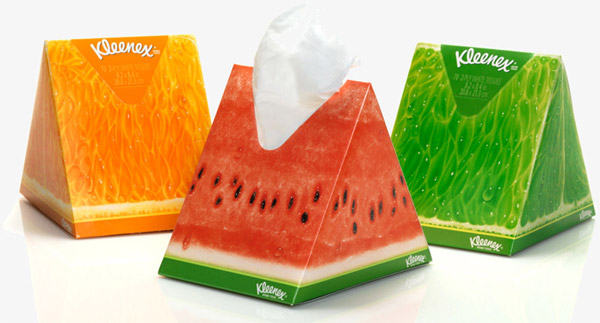
Kleenex’s sales spike in winter due to the inevitable cold season. Obviously during the summer months, their sales take a dip. In an effort to change this, Kleenex released new watermelon summer packaging with the idea of bringing them to a picnic and to look nice in the home during the summer months. The result of this packaging was great; “Sales of the novelty box not cannibalising sales of standard Kleenex boxes and were close to 100% incrementally.” Not only did this new packaging mean Kleenex could still sell during summer, it also brought a whole new consumer base who needed tissues not just for the flu.

If you need any advice on seasonal packaging or think this could be right for your brand, give Slice a call on 020 8222 6999 or contact us here.

We are recognised as a Top Beer Logo Design Company on DesignRush

Seasonal packaging – should you do it? Read More »

slice blog logo

Minimalist vs Colourful Packaging

Which style should you go with?

As a brand, you can either choose to create packaging that is bursting full of colour or the complete opposite with a stripped back minimalist design. This decision heavily depends on what you want your brand to portray and your positioning within the market.

Today we will be looking at the pros and cons of both.

Colour

What words do people associate with big, bold and colourful packaging?

  • Fun
  • Creative
  • Confident
  • Delicious

Brands exploding with colour and bold print on pack will appear confident in their product and sure of the claims they make. The colours on pack may also help increase appetite appeal by representing the flavours inside. Something that is bright on shelf will also help achieve shelf stand out from a distance. Read out post of tips for shelf stand out here.

Risks

When using colour, it is important to ensure the colours used don’t look too artificial as this can actually put people off. Anything too artificial will appear unhealthy. Another risk is your competitors on shelf potentially using bold colours too and you fading into the background. This is why at Slice we do brand positioning for our clients before starting any design work so we can have an extensive look at your competitors.

Minimalist

What words do people associate with minimalistic packaging?

  • Luxury
  • Simple
  • Elegant
  • Healthy

There are many different variants of minimalist packaging, from simplistic monochrome packaging to a design that is completely stripped back to just the brand name. There has definitely been a trend in muted packaging recently from chocolate bars to alcohol.

People often associate minimalistic packaging with premium. We’ve had many clients come to us and say they want their brand to appear expert so they want black, white and gold packaging. So what are the risks of this?

Risks

Your first risk is not standing out on shelf. If your packaging is too simple and stripped back, there’s the chance that it may not stand out against your bolder competitors. If you want to position your brand as ‘premium’ but priced competitively, your customer may be put off by thinking it is far more expensive than it actually is at first glance. Also, if you want a clear front of pack with just the brand name, the consumer may end up searching for the claims themselves on pack – something they will not want to do!

Examples of both

Mandarin natural chocolate is an example packaging that is very minimalist. The front of pack simply includes the brand name and the intensity level of the cocoa – something that is a key USP for them.

We asked one of our team their thoughts on the packaging below..

Answer: “This pack is quite striking as it’s so unusual. I am not sure how well it would work on shelf though as there is no appetite appeal”

The Juice Cleanse are another brand who have opted for simple packaging. The packaging clearly states the benefit of the product before you even see the brand name – a bold move but hopefully one that pays off if you grab the consumer by the clear benefit. This type of packaging emulates transparency and honesty. Listing the ingredients on the front of pack proves they have nothing to hide.

We asked one of our team their thoughts on the packaging below..

Answer: “This pack gives off an earthy, organic vibe straight away. I like that it tells you the benefit before the flavour to capture your attention.”

Now onto colour. Pukka are known for their intricate details on pack to emphasise the heritage of their flavours. This certainly stands out on shelf against their competitors. The use of patterns instead of block colour grabs your attention and clearly shows that the reason you should pick them up is taste. Whereas other tea brands focus on tradition – Pukka are all about the flavour!

We asked one of our team their thoughts on the packaging below..

Answer: “I love the infusion of colours, it’s somewhat mesmerising to look at! I can imagine this wouldn’t be everyone’s cup of tea though (ba-dum-ch)”

When we redesigned Great Food’s range we wanted to really emphasise how great the product tasted and created a design that is bold, impactful and proves Great Food is ‘Braver with Flavour’! You can see below the effect colour and bold type makes comparing the old and new designs.

We asked one of our team their thoughts on the packaging below..

Answer: “Great Food automatically shouts “tasty” to me and is full of impact. I would definitely pick this up on shelf to read more.”

In conclusion, there is no right or wrong option. You should work out exactly what your brand stands for and how you want consumers to see this. If you do go with minimalist packaging you have to be sure that the product/brand can support this.

As Kevin Keating at PKG states:

“Exceptional minimalist design often has a single feature that stands out above all else. In the food realm, this requires understanding of a brand’s unique value proposition (UVP). In other words, designers must understand why their customers typically choose their products, and make this concept the focal point of their design.”

The opportunity you have with both is to be clear to the consumer, whether that’s through bold type, colour, highlighting the USP or flavour differentiation.

Which type of packaging do you prefer? Let us know below.

Find Slice on Design Rush 

Minimalist vs Colourful Packaging Read More »

slice blog logo

Slice’s Top 5 Tips For Shelf Standout

How do you ensure your brand stands out on shelf?

When designing packing, it is important to not just make sure it looks good on it’s own, but also when set against your competitors. That’s why at Slice, we regularly look at shelf shots for our clients as it’s important to envisage how the final pack will work at shelf.

Below we’ve collated our top 5 tips to ensure shelf standout. Enjoy!

1. Utilise your packaging 

Think ahead to when the pack will be on shelf, how will it look with the rest of the range? Techniques such as shelf blocking through the use of strong brand colours and details, creates a compelling visual to lure consumers towards the brand to discover more.

Boddingtons have ensured a compelling identity on shelf by using the B (and bee) on their outer packaging (as long as people stack it the right way)

Alpen are also a brand who make sure they make their mark on shelf due to their letters joining up from the n to the A. When stacked next to each other there is a fluidity across packs, making the brand name stand out very well – great for instant recognition amongst shoppers.

2. Dare to be different

Now this could be a scary one to some people, but sometimes it pays off to be different. It’s a chance to disrupt the shelf through either colour, imagery or specific print techniques.

If this is too risky for you, why not try dipping your toe into the water with a limited edition pack and see how the reaction to it is?

Take Kleenex for example who come out with bold new editions that really make an impact. Oxo also make a statement by using letters across their packs to spell out their brand name on shelf. Certainly grabs the eye of a shopper!

3. Be clear on shelf

When a customer is looking for products, the last thing they want to be doing is having to search the pack for claims or benefits – especially in a supermarket. Having these clearly displayed on the front of pack or SRP makes it simple for the customer to know exactly what they are getting and they are therefore much more likely to pick up your product.

We’re not saying load the front of pack full of claims – as no-one has the time to go through that! Be selective and pick the best attributes of your product to emphasise.

Take Cilit Bang for example, when we designed their pack we created icons so it would clearly and concisely explain the use of the product. Clover also display the benefits of each of their products on the corresponding SRP – making for easy navigation per range.

4. Be smart 

Don’t be single minded when it comes to pack design. What else could you do with it?

Is there an opportunity to also educate your consumer as we did for Aquafresh? Through iconography, simple and effective brand architecture and navigation, educating and guiding the consumer to purchase and beyond, ensures quick decision making and trust in simplicity.

Could the packaging be multi functional and turn into something else after you’ve used it, maybe to aid the product?

Or could it be environmentally friendly to backup your brand proposition? Enabling your packaging to take up less space or perform better through the use of less, is an aspect that is continuously becoming of concern and importance for consumers.

Duracell have been very clever with their point of sale in ensuring they utilise their brand equity. There’s no mistaking what that is!

5. Don’t forget shelf ready packaging & POS

And lastly, do not forget SRP’s and POS! This is very important as sometimes it’s an afterthought, taking a back seat to pack design. Once your product is on shelf, it’s main purpose is to sell and your product will only sell if people pick it up. An SRP can display information that isn’t on the front of pack or claims that you want to shout about.

Take Fairy as an example who use SRP to their advantage. Compared to their competition, they clearly stand out from afar by communicating value.

In order to utilise the shopper marketing channel appropriately, it is vital to ensure that brand equity is emphasised and strengthened through these channels, which can also create a brand world environment for consumers to experience.

If you really want to make an impression, make full use of your POS. Be as creative as possible and have some fun! Walls, Nutella, Listerine and Colgate are great examples of brands who use their POS to their fullest potential to get people talking!

If you have any other tips for shelf standout or brands that always catch your eye in the supermarket, we’d love to hear about it –  so leave us a comment below.

Images courtesy of Toucan, Alamy Stock photo and DBA Design Effectiveness Awards

Slice’s Top 5 Tips For Shelf Standout Read More »

slice blog logo

Redesigns of brand logos that caused outrage..

A brand’s logo is an integral part of any business so when you’ve made the decision to rebrand your logo, naturally you want people talking about it. However, what happens when all that chit chat about redesigns is negative?

Today we will be looking at 5 brands redesigns that caused very controversial opinions with the public when they revealed their new logo. All new logos are on the right.

You can’t please everyone with redesigns!

First up is Uber who released their new logo without their infamous “U.”

Peoples main concerns were not being able to find the app quickly on their phone when flicking through pages of apps as it’s no longer instantly recognisable.

In its press release regarding the update, Uber argued “Uber no longer moves just people; we’re now moving food, goods, and soon maybe much more. With the potential for many apps with many app icons, we needed one approach that connected them all. So we came back to our story of bits and atoms.” 

However, it’s not all negative. One of our team members here are Slice thoughts:

“I personally like the new logo. It’s an abstract icon that pinpoints your destination – exactly what you want from Uber.”

When Airbnb released their new logo in 2014, they took took some serious backlash from the public – with many commenting on the similarity to Automation Anywhere’s logo. Others simply didn’t understand what the symbol was meant to be with multiple memes created of other (ruder) meanings.

In their post regarding the update Airbnb state: “Belonging has always been a fundamental driver of humankind. So to represent that feeling, we’ve created a symbol for us as a community. It’s an iconic mark for our windows, our doors, and our shared values. It’s a symbol that, like us, can belong wherever it happens to be.” 

We at Slice are glad the old logo is gone. It reminded us of WordArt you chose for your year 8 homework!

In 2000, BP undertook a $200m rebrand in an effort to showcase and highlight their green credentials to the public. The famous shield was replaced with a much friendlier and brighter flower shape.

Unfortunately the new logo was met with numerous parodies – most famously Greenpeace who ran a competition for a more appropriate logo. Oh dear!

For 20 years, Gap’s logo has been the unmistakable white writing in the blue box. In 2000, they decided to shake things up and release a brand new logo. The new logo received heavy criticism and complaints especially on social media. On Facebook in particular there were more than 2000 complaints demanding the old logo back. Whoops!

Gap listened..

Marka Hansen, president of Gap Brand North America posted this on the company website a week later.

“We’ve been listening to and watching all of the comments this past week. We heard them say over and over again they are passionate about our blue box logo, and they want it back.So we’ve made the decision to do just that – we will bring it back across all channels.”

This may be one you missed as it was only out for 1 week!

Now, this isn’t a redesign but it is a certainly still a logo that backfired. The London 2012 Olympics logo’s aim was to tap into the youth market. Unfortunately, they hated it. A study reported 70% of 11- to 20-year-olds disliked the logo. 68% of respondents reported they “hated” the design, with more than half saying this was due to it not saying anything about London or the UK.

Rawsthorn on Instagram comments: ”I felt then – and still feel now – that the 2012 logo was memorable for the wrong reasons, because it looked to garish with its clumsy typography and garish shapes”

How they handled the criticism?

Ije Nwokorie, managing director at Wolff Olins who designed the logo states: “Interestingly, the critical reviews tend to point out the rules we’ve broken, and in that sense they tend to be correct; the only disagreement is whether those rules need to be broken.”

Based in London UK, Slice Design are a top international creative branding and packaging design agency that have helped consumer brands grow and get noticed since 2004. We like to think of ourselves as a challenger to the large agency. As the name suggests we cut through jargon with our flexible, no nonsense approach and down to earth attitude. You can see some of our recent packaging design work here.

What are your thoughts on the redesigns above? Do you think it’s right they all received such heavy criticism. You have to hand it to Gap for listening to their customers and reverting back to the old logo. I can’t imagine how painful that process must have been!

Redesigns of brand logos that caused outrage.. Read More »

slice blog logo

Slice’s logo recognition quiz

How well do you think you can recognise a logo?

We’ve cropped, removed text and shown you snippets of logos below for you to guess. Having a logo that is still instantly known even though it’s not in it’s full form is proof it’s done it’s job.

Give the quiz a go and let us know your score. Good luck!

Let’s start of easy..

1. Who’s is this logo?

Hint: Ba da da dada

2. How about this one?

Hint: It can be pronounced one of 2 ways

3. Recognise this logo?

Hint: TT

4. Who owns this?

Hint: A grande company 

5. Who’s holding shape is this?

Hint: Need to phone a friend?

Ready for some tricker ones?

6. How about this one?

Hint: Don’t melt under pressure

7. Who’s swoosh is this?

Hint: Love is in the air 

8. Any ideas?

Hint: London Look

9. Do you recognise this logo?

Hint: Really delivers

10. What company uses this in their logo?

Hint: You’ve got to be a smartie to get this one

11. Who uses this shape?

Hint: Pussycat doll approved

Ok expert level now..

12. Who’s A is this?

Hint: This one’s a bit hairy

13. Which logo is this from?

Hint: Our passion

14. Who’s text have we removed?

Hint: Is this getting under your skin?

15. Who uses this holding shape?

Hint: Great genes

16. What logo could this be?

Hint: Wait a minute

17. Can you guess this one?

Hint: Saucy by nature 

ENTERING ADVANCE LEVEL

18. Give this one a go

Hint: For any occasion 

19. Here’s a tricky one for you

Hint: He says yes

20. Last one!

Hint: The way I are

What’s your score? Tell us below…

Answers are as follows:

  1. Mcdonalds
  2. Nike
  3. Audi
  4. Starbucks
  5. Samsung
  6. Cadbury
  7. Airwick
  8. Rimmel
  9. FedEx
  10. Nestle
  11. Muller
  12. Aveda
  13. Purina
  14. Vaseline
  15. Levi
  16. Ocado
  17. Knorr
  18. Hallmark
  19. Del Monte
  20. Timberland

Discover the Best Beer Branding Agencies

Based in London UK, Slice Design are a top international creative branding and packaging design agency that have helped consumer brands grow and get noticed since 2004. We like to think of ourselves as a challenger to the large agency. As the name suggests we cut through jargon with our flexible, no nonsense approach and down to earth attitude. Take a look at some of out latest packaging design work here

Slice’s logo recognition quiz Read More »

slice blog logo

Are brands becoming more global or are consumers becoming more similar?

It isn’t difficult to see the effects of globalisation on brands, pretty much any major city you go to will have a Mcdonald’s at the end of the street. 

Does this mean that companies are becoming more global and in effect forcing a homogenous voice onto consumers? Or are consumers around the world becoming more similar and as such demanding more similar products?  We’d like to examine this by analysing the market presently and the growing trends emerging.

In 1983, Theodore Levitt, a professor at Harvard championed the idea products were becoming more standardised in order to help growth.  Levitt argued that by stripping the products, services and communication down to the most uniform level, companies would be able to find a voice that would work on a global level. 

Understanding the complex effects of globalisation on consumer purchases is an important point to address.  Consumers are becoming more similar as a result of globalisation. Whilst retaining differences due to “demographics, psychographics, personality, motivation, knowledge, attitudes, beliefs and feelings”.  It is understanding this delicate, ever evolving relationship which is key to the success of global brands.

Globalisation & Homogeny

With globalisation comes great opportunity for businesses. Both large and small, to participate in shared dialogue by throwing ideas, products and cuisines into a large mixing pot. This is not to say, however, that all products and consumables will end up being the same around the world.   

With the rising population in developing countries, companies can not ignore the importance of managing their global characteristics. It is reported that by 2030, 90% of the world’s population will be living in developing countries.  The global brands who are successful have learnt to adapt and integrate popular elements of the host countries culture. For example KFC’s in Shanghai serve porridge for breakfast and Peking Duck burgers for lunch. In a similar vein, Starbucks in Beijing serves an array of green and aromatic teas which are popular in that culture. 

However, there is an inevitable movement of worldwide supermarkets looking more and more similar through global acquisitions and JV’s.  Although it makes the supermarkets look more similar, some may argue it actually provides more variety in the brands offered.

Ideas and trends are also becoming more global through a common conversation had via marketing, social media, etc.  A recent global trend is the demand for breakfast “on-the-go”, which provides consumer’s with a more convenient morning meal to be had in-between their ever busy schedules.  This movement may have had more impetus in Germany initially, but it now set to expand on a global level.   

The tea industry has definitely felt the effects of the globalisation of coffee shops.  About 1.7bn cups of coffee are sold each year in the UK from more than 18,000 outlets – a total set to grow to almost 21,000 by 2020, according to Allegra Strategies. In the UK people consume an average of 2.8kg of coffee each year.

Last week JD Wetherspoon, the caprice pub chain, brought the coffee price war to the boil by cutting the price of its Lavazza filter coffee to 99p, with free refills. The company now sells almost 1m coffees a week and more people visit the pubs for breakfast than Pret A Manger or Caffè Nero, according to CGA Peach, the food and drinks consultancy.

Reports have shown that global coffee chains such as Starbucks, Pret and Costa have still been able to hold their standing in the wake of the coffee boom. With consumers continuing to choose to frequent chains that they know and trust.  Interestingly, we have also seen a growth of strong artisanal independent coffee shops for those consumers who are rejecting the standardised offering of coffee.

Health concerns go global

Another result of globalisation and the common dialogue had is that trends now prevail on a global level.  In recent years, there has been growth in a worldwide health consciousness through education. This has resulted in an explosion of health related products being brought to the market.  A growing trend is for natural foods which also have an added benefit.  Drinks are appearing on the market which have “added benefits” such as antioxidants, prebiotics, probiotics, electrolytes and fiber.

Resistance to globalisation

As with any significant socio-economic movement, globalisation has been met with some resistance. Transnational companies such as Apple and Starbucks have been at the forefront of this backlash. The more global the company, the more scrutiny on practises such as their corporate responsibility to environmental issues, staff wages and so on.  A response by a number of consumers is to reject transnational companies which do not speak to them on a “personal” level. 

Personalisation

As a result of this, we have seen a number of companies attempting to appease these consumers through a more personal experience.  A particular industry which has focused on this recently is the beauty industry. Reports suggest that there is a strong movement to the “personalisation” of beauty products to serve consumers individual needs.     

Craft

The rise of all things “craft” in the liquor world also indicates the rejection by some consumers of big, global, impersonal brands.  The term “Craft” has become synonymous with the idea of a premium product, manufactured with experience and skill, and often produced on a more limited scale.  The success of the craft movement has now spread to spirits, soda and coffee.  It is forecast by some that the craft movement can expand to 30% of the market share in the beverage sector. A caveat would be that due to the popularity of the craft trend, some brands are attempting to capitalise on this by duping consumers into marketing global products as “craft”. 

Conclusion

It could be argued that by way of force, globalisation of companies and the expansion of their brand reach, consumers are being ‘forced’ to chose the same brands. be that if they consume them in Finland, China or Argentina.

Although participating in this transnational dialogue will no doubt help aid companies global growth, it would be naive to assume that all consumers are wanting to participate in the exact same way. There is strong evidence to suggest that although a common, global voice is evolving. This does not mean that consumers want to reject the specific influences of their cultural upbringing.  Therefore companies contending on a global scale will need to consider specific consumer needs and cultural influences.  By perhaps rather delicately incorporating both elements, companies can find great success.  What is certain is that the world and the way in which consumers are engaging is ever evolving. As such companies need to continually monitor this and strategise accordingly.

Let us know your thoughts on the above here.

Are brands becoming more global or are consumers becoming more similar? Read More »

slice blog logo

Which brands have re-branded to a simplistic logo?

Following our previous post “New Survey reveals “simplest” Brands”we have looked at brands who have followed this trend and opted for a more simplistic logo design.

All new brand logos on the right…

1. Co-op

In 2016, Co-Op reverted back to their roots by modernising a version of their 1968 cloverleaf logo.

Co-op group design director Ben Terrett says:

“With the new membership offer our own brand products become more important than ever and this new look brings a simplicity and helps them stand out more.We want all our products and services to be simple and user focused and this is an essential part of that work.”

2. Kodak

Kodak also took a step back to their past by re-designing their logo which mirrored their classic logo used between 1971 and 2006.

3. Deliveroo

Deliveroo’s new logo includes a more simplistic character turned into a bold icon for impact. See their redesign story here.

4. Mastercard

Mastercard have also taken a cleaner approach re-branding and for the first time in 20 years re-designed a new logo.

Whilst the logo has been stripped back to its core, research conducted by Mastercard following the rebrand found that more than 80% of consumers still recognised the symbol without inclusion of the name.

5. Gumtree

The new Gumtree logo reduces a lot of clutter which the previous logo had. This new simplistic approach will hopefully convey to customers how seamless their service is.

6. Instagram

Now for the one that caused the most controversy. The retro looking camera icon was replaced with a colourful, simpler logo that wasn’t liked by many.  Slice Design’s Director, Alan Gilbody, discussed his views in the blog post “Following the herd” which you can read here

A spokesman for Instagram said: “We’ve been inspired by all the ways the community has grown and changed, and we wanted to create something that reflects how vibrant and diverse storytelling on Instagram has become”

What do you think of these more simplistic logos? We’d love for you to tell us below.

Based in London UK, Slice Design are a top international creative branding and packaging design agency that have helped consumer brands grow and get noticed since 2004. We like to think of ourselves as a challenger to the large agency. As the name suggests we cut through jargon with our flexible, no nonsense approach and down to earth attitude. You can see some of our recent packaging design work here.

Which brands have re-branded to a simplistic logo? Read More »

slice blog logo

New survey reveals “simplest” brands

Simplicity is key; especially when it comes to brands and consumer engagement.

In a recent survey conducted by Siegel+Gale, 14,000 respondents across US, UK, Germany, Sweden, China, Middle East, India and Japan ranked 857 brands in terms of simplicity. 

The survey results revealed that 64% of consumers were willing to pay a higher price point and 61% would recommend a brand because of a simpler experience.

So, who are the winners and losers?

The Top 10 are as follows:

  1. ALDI
  2. Lidl
  3. Google
  4. Netflix
  5. IKEA
  6. Amazon
  7. KFC
  8. YouTube
  9. McDonald’s
  10. SUBWAY

Aldi has held the top spot title for the 4th year running. Go Aldi!

“Aldi was recognised for its simple, consistent store layouts alongside affordability and a stress-free customer experience, while Google was recognised as having a pristine and no-nonsense homepage and an intuitive user experience. Its changing logo also demonstrates  personality and a sense of humour. Ikea was recognised for its “minimalist” designs and variety of products, while Amazon was noted for its two-click online user shopping experience.”

At the bottom of the survey were brands including AXA, followed by Aviva, Bupa, Linkedin, Avis, MetLife, Hertz, HSBC, Ryanair and Budget.  Results from the report suggested consumers perceived these brands to be complex and confusing.

Interestingly, brands such as Co-op and Kodak have recently reverted back to their former logos for a more simplistic and straightforward approach. So, is this the way forward?

Howard Belk, chief creative officer at Siegel+Gale says the research shows that “brands that embrace simplicity are more profitable”.

What can brands do to deliver more simplicity?

The Simplicity Index reveals what brands can do to deliver more simplicity to consumers:

  • Empower people
  • Reimagine experiences
  • Remove fiction
  • Save time
  • Provide unity

To visit the full report click here 

Do you agree with the top 10 list? Let us know brands you think are the most simplistic below.  Amazon tops the list for Charlotte, our account manager at Slice.

Discover Slice and Creative Logos on Design Rush. 

New survey reveals “simplest” brands Read More »

slice blog logo

Rum-tastic times

Anyone who has not lived under a rock for the past five years must have noticed the astronomic rise in craft gin. Gin lovers have truly been in heaven, lapping up the genièvre syrup in gin specific bars and even restaurants across the globe, with its epic centre in London.

However, it seems there’s a darker, more sweet liquor making its mark recently.  Golden, dark rum, produced from sugar cane, was discovered by European explorers in the 1400’s in the West Indies.

In the 17th century, thousands of sugar works dotted the islands landscapes and nearly every plantation employed a copper pot still to make alcohol from the fermented skimmings and molasses.

Although a very old drink, it has not had its proper heyday….until maybe now!

With the connoisseur and more crafty spirits movement growing by the day, it seems the need for alternative tipple has flowed onto rum, which is now becoming a favoured drink in bars and at home.

The amount of rums launched within the past two years alone, bears great witness to the rise in popularity and demand!

Given that the provenance for this spirit is so rich, it further offers ample inspiration for branding and packaging design.

The Duppy Share are a rum company taking London by storm.  Last Friday, we were lucky enough to welcome them into our studio and try out their delectable rum concoctions.

We had the pleasure of tasting a delicious “Duppy Conqueror” cocktail, which certainly got us in the mood for the weekend!  If you fancy trying it for yourself, check out the recipe below…

Our Favourites 

Some of our favourites, in terms of design and taste are;

Whether you take it neat, or in cocktails such as a rum old-fashioned or a Dark and Stormy, ensure you stick to the holy trinity of rum; aged, dark and from good heritage!

From our studio in Hammersmith, London, we work for clients around the world: global and local, big household names and small startups, challengers and leaders. Whether a big brand re-design, NPD launch or simple packaging updates. We’re proud to remain flexible, refreshingly honest and wholly independent.

You can see some of our recent packaging design work here

Rum-tastic times Read More »

slice blog logo

We are moving….

Team Slice are very pleased to announce that we will be moving back to our old stomping ground of Hammersmith in the first couple of months of next year.

We have secured gorgeous new studio space, slap bang in the middle of Hammersmith – More details to follow!

We look forward to moving and welcoming you to our new offices.

Based in London UK, Slice Design are a top international creative branding and packaging design agency that have helped consumer brands grow and get noticed since 2004. We like to think of ourselves as a challenger to the large agency. As the name suggests we cut through jargon with our flexible, no nonsense approach and down to earth attitude.

No fancy trademarked processes and no hidden extras. The benefit to yourselves is all the experience but with the flexibility that large packaging design agencies cannot deliver.

From our studio in Hammersmith, London, we work for clients around the world: global and local, big household names and small startups, challengers and leaders. Whether a big brand re-design, NPD launch or simple packaging updates. We’re proud to remain flexible, refreshingly honest and wholly independent.

You can see some of our recent packaging design work here

Feel free to drop us a line or pop in and meet us in person!

Team Slice.

We are moving…. Read More »

Scroll to Top