A big thanks to Feedspot for including us in this list and to everyone that reads our blog. We hope you enjoy our posts as much as we enjoy writing them.
Design agency blogs are usually nothing but word-salad peppered with every buzzword imaginable. We don’t see the value in sharing that. Our blog is about slicing through the jargon to give you focused tips and insight based on the stuff we deliver best. Top quality branding and creative.
About Slice Design
Based in London UK, we are a top international creative branding and packaging design agency that have helped consumer brands grow and get noticed since 2004. We like to think of ourselves as a challenger to the large agency. As the name suggests we cut through jargon with our flexible, no nonsense approach and down to earth attitude.
No fancy trademarked processes and no hidden extras. The benefit to yourselves is all the experience but with the flexibility that large packaging design agencies cannot deliver.
From our studio in Hammersmith, London, we work for clients around the world: global and local, big household names and small startups, challengers and leaders. Whether a big brand re-design, NPD launch or simple packaging updates. We’re proud to remain flexible, refreshingly honest and wholly independent.
You can see some of our recent branding and packaging design work here
“This year’s study clearly shows how millennial and gen z consumers are increasingly interacting with brands through online and mobile shopping technology. More than one-third of apparel shopping is conducted online, 35% for women and 42% for men, and consumer values are shifting to focus on efficiency, speed and convenience.”
Discover the top PEO Companies here
What would be your top brands in each of these categories? Let us know here.
It’s not easy starting a business. 13 years ago, we at Slice were in your shoes and a start up ourselves.
It can be extremely daunting and challenging being a start up but if you get it right, also incredibly rewarding and exciting. Being an independent agency means we have the flexibility to work with entrepreneurs and start ups as we understand the challenges you face.
We love the passion of start ups – the excitement and joy when they see the finished product that was once merely an idea over a glass of wine. Today we’ll be sharing our top tips and advice for start ups, when dealing with a design agency.
1. Be prepared for questions
When you first speak to a design agency, you should expect to answer questions regarding your brand so please be prepared. These questions are vital for the agency to understand the project in totality.
Usual questions you can expect are:
What is involved e.g packaging graphics, naming, website etc?
What is the main objective of the project?
How many master packs are involved?
How many additional variants do you have?
When is your deadline?
Do you have any mandatories?
What is your budget?
We often get asked what is a master and run-on. Let’s take our designs for Stork for example. The master here will be the chocolate pack and the other 2, run-ons. This is because they follow the same style design but with minor changes such as colour and flavour.
What would make them all masters? To all be masters they would have to be a different format or each be a different product e.g. Victoria sponge, cupcakes and muffins.
2. Don’t skip brand positioning
A brand is what your customers perceive about you and how you make them feel. Therefore brand positioning is about developing a unique perception abut your brand in the mind of the consumer.
We look at what you can credibly say about your brand, what makes you relevant and also what makes you different. We then create a unique opportunity for your brand so you can be assured you will stand out against competitors. Having a unique proposition means it is much easier to sell your product into retailers.
3. Meet your agency
Before you agree to anything, we would always recommend meeting your agency. It’s important that you have the right chemistry as your account manager will become your best friend.
You need to feel comfortable enough to pop into the office and see the progress of your project. Can you imagine having a cuppa with them?
At Slice, we have created a service specifically for start ups to make sure you have a viable brand and pack design that fits your budget as a startup company.
4. Don’t have afraid to have opinions
If you want your pack design to be a certain style, colour or name – SPEAK UP. Don’t worry about having an opinion. A good agency will listen and discuss your ideas. Even if it’s not the right way to approach things, they will explain why not.
Working with a design agency should be a partnership.
Alternatively, don’t worry if you have questions. A lot of agencies can use jargon that’s just fancy ways of abbreviating words. If you need clarity on something, whether that be a phrase used such as ‘cutter guide’ and why the design is that colour? Ask. It’s your investment!
5. Have fun as a start up
When designers get their hands on a start up brief, they are often the most exciting. The passion of an entrepreneur who lives and breathes their idea is inspiring. We understand that it can be stressful but don’t forget to have fun! Pack design is creative, adventurous and exciting. The nutritional bits and bobs can be the tricky part but leave that to the professional agencies to worry about.
Our main bit of advice would be to see branding as an investment. For a new brand which no one knows, how it looks on shelf/online is vital to it selling. The design of your packaging needs to catch people’s eye and encourage them to pick it up. How it looks will effect the future of your brand. Good luck!
Choosing healthy options for childrens’ lunch boxes can be difficult with the amount of processed and pre packed foods that are widely available.
Following from our blog post last week where we looked at innovation in children’s packaging due to new rules around childhood obesity, we have looked at alternatives that can be incorporated into lunch boxes to satisfy health credentials and get healthy food into children whilst presenting opportunities to expand your portfolio of products.
Sandwich Alternatives
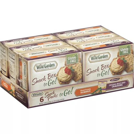
Humous is a healthy snack that can come in a variety of flavours and snacking options. Instead of the usual carrot and humous combinations, brands such as Wild Garden, Sabra have looked at incorporating crackers with humous to make it a 2 in 1 snack.
Sunbites have expanded their range from just crisps to crackers and salsa in the same pack. A great way to fill you up and expand their portfolio.
Brands such as Seeds of Change and Merchant Gourmet have released microwaveable packets of their products. Even though they are not to put in lunch boxes, they are quite convenient and quick to heat up the night before to mix with something – perfect for busy mums.
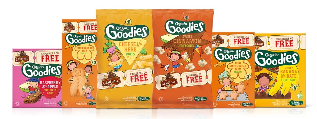
Super Yummies and Organix are some of the brands who have introduced small packs of crackers, breadsticks or pretzels, which can be put into lunch boxes on their own or accompanied by a dip. Healthier options include spinach sticks and kale chips.
Falafel is a nutritious and healthy alternative to the sandwich. It can come in a variety of flavours such as moroccan and mediterranean and garlic. Brands such as Great Food have an extensive range of vegetable bites perfect for lunch boxes. It’s not just for vegetarians!
Snacking Alternatives
Seed brands such as Superseeds and Good 4U have produced single seed packs that are transportable in a pouch form. These are ideal for a lunchbox, on their own or sprinkled over salad to add something extra.
Similar to seeds, nuts are perfect for a lunchbox snack. A trail mix will provide a mixture of nuts and fruit, however the market currently does not have any specifically aimed at children.
If children are struggling to eat fresh fruit, dried fruit can be a good alternative snack. Sachets, packets or pots of dried fruit will be great on their own or covered in yoghurt/chocolate as an extra treat.
Small olive pots for children can be another option for lunch boxes. Oloves and Pearls are some of the brands who have already explored “on the go” olives in small tubs. These olives could also come with dips/feta/roasted tomatoes etc.
Instead of the usual chocolate bar or crisp snacks, some brands are looking at alternatives for these. This includes raw chocolate bites, mixing fruit and chocolate, healthy crisps and raw cereal bars. Mars have released packs combining chocolate, fruit and nuts.
Holland and Barrett have a range of snack-able toasted vegetables which range from sweetcorn, broad beans, chickpeas to coconut curls. The Happy Snack Company have also released a range extension of toasted beans for kids snacking.
Brands such as Eat Real and The Giving Tree have produced crisp alternatives that include pita, quinoa, hummus, vegetable and lentil crisps. For parents who want something a bit healthier for their children – this is a great option. Again, another alternative to crisps is popcorn. Small tubs/packs of popcorn could also potentially be mixed with nuts, fruit, seeds or even chocolate.
Would any of these products fit into your range? If so give us a call or pop us an email to discuss these opportunities.
Is the future of packaging for children about to change?
From July this year the Committee on Advertising Practice (CAP) released the following rules in response to the increasing concerns of childhood obesity that will shake up the world of marketing:
Ads for HFSS (High Fat, Salt or Sugar) products cannot appear in other media where children make up over 25% of the audience.
Ads for HFSS products will not be allowed to use promotions, licensed characters and celebrities popular with children; advertisers may now use those techniques to better promote healthier options.
The Department of Health nutrient profiling model will be used to classify which products are HFSS.
Celebrities and cartoon characters will be banned from promotional material but not food packaging. Does this mean more brands will use this to their advantage on their packaging or avoid this completely so it doesn’t cause issues in the future?
The Dutch food industry has already made a boldmove in deciding to remove popular children’s characters from the packaging of unhealthy foods.
“The decision, which is the first of its kind in Europe, will mean characters including Dora the Explorer, Disney’s Frozen heroines and Miffy the rabbit, are to be banished from food and drinks high in fat, salt or sugar which are targeted at children.”
How influential are children?
Although not necessarily active consumers themselves, children will certainly try to influence what their parents buy them. If something catches their eye on the shelf, they will go on about it until their parents give in. It’s important the packaging not only stands out for the adult but also the children.
As packaging digest quotes ”Kids influence up to 80 percent of all household purchases. And as a market segment, they are impossible to ignore. In fact, ignoring them may mark the beginning of the end for your brand.”
6 months:
Babies are able to recognise brands by forming mental images of logos and mascots
Age 2:
Brand loyalty may begin
Age 3:
Specific requests for brand name products
Age 5:
Children are ready to make their own (parent financed) purchases
Age 7:
Control over their own decisions
Pretty influential it seems! Stats are courtesy of Packaging Digest
What can brands do?
The best children’s packaging is made with a good sense of humour as well as fun and colourful design elements that make them stand out against competitors. Below we have looked at some of the best examples that we can find. These go the extra mile for innovation and have Slice Design’s approval!
Smoothie Safari connect their straw and the packaging to bring the animal to life
Beehive use the bear on pack as a fun way to encourage children to eat their breakfast cereal
Bla Bla use their packaging as an open mouth to display the products. An exciting way for kids to open the pack and dispense the sweet for consumption
Similarly Cloetta use the mouth concept as a cool way to open the chocolate inside
Coromega use a friendly character to represent the packaging on their healthy food – encouraging children healthy can be fun
A lot of brands such as Heinz & Tilda rice have released kids ranges as they know the potential and revenue this market can bring. It’s important that these packs are different to the normal parent branded packaging which both Heinz and Tilda have done – Tilda use elephants on pack to appeal to the younger generation.
It will be interesting to see from July what the impact of the new rules means for the future of children’s packaging. Which of these packs do you like? Tell us here.
With Easter coming up, some brands will be releasing their Easter packaging. Whether this be limited edition products or existing stock in new packaging, this is a great opportunity to boost sales or reach a new consumer base if you are smart about it.
Below are the most common times that brands tend to use seasonal packaging:
New year
Valentine’s day
Mother’s day
Easter
Father’s day
Summer
Halloween
Christmas
Major events e.g olympics
However, not all of these will be applicable to your brand. Understand which can tie in with your product/brand and improve sales, as opposed to just being an addition product that doesn’t fit in your range.
For example if you’re a chocolate company you are in a much easier position to produce Easter or Valentines seasonal packaging. If you are a sports drink brand, it’s a bit more difficult. Maybe Easter isn’t the best option for you – why not try new year? Target those gym bunnies and their new year’s resolutions.
The key with seasonal packaging is to plan in advance – don’t leave it till last minute with Easter two weeks away! Packaging can take months to complete and launch if you also consider printing. Set yourself a plan of holidays that you believe suit your brand and possible ideas to brief into an agency. Also, have a look at your competitors to understand if they are doing something similar. You obviously don’t want to recreate exactly what they are doing!
It is important to not take away from your brand with the new packaging. For example, don’t alter your packaging so much that no one can identify it. Try to keep your brand logo the same as this is integral to customer recognition. Do use additional colour and graphics that represents the relevant season, but don’t go overboard!
In 2011, Coke’s Arctic Home campaign saw the launch of a brand new white can for Christmas. However, the white and silver can confused their customers who said it looked too much like Diet Coke and actually led to diabetic customers accidentally drinking it. The famous red can was brought back just 1 month later..
You can have a lot of fun with seasonal packaging, turning it into a social media campaign or making the packaging interactive so it leads to the website, creates buzz around your brand and gets customers interested. For example at Easter, you could hide a small Easter egg on pack for people to find. Why not try doing personalised holiday packaging too. Nutella often do personalised named packaging in shops around London at Christmas for a perfect Nutella lovers gift. Get creative!
Seasonal packaging is also a great way to introduce new products into the market. If you have a new product that you think may not work too well, launching it for a few weeks as part of a seasonal campaign is a good way to test the waters. You can see how well it sells and gather people’s thoughts to understand if you should launch it long term. It may also be that it sells very well during the particular season and you know that every year you should launch that limited product at the same time to boost sales.
Be smart with your seasonal packaging. Could the packaging be of another use to consumers once they’ve consumed the product itself? For example in summer, could you give instructions on how to turn the packaging into a fan to cool you down? Or for Valentines, could the pack have a ready to cut out heart shape to give to your partner? Turn it into something collectable to really make an impact with customers.
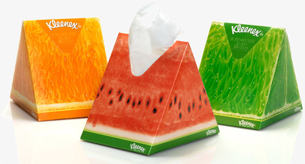
Kleenex’s sales spike in winter due to the inevitable cold season. Obviously during the summer months, their sales take a dip. In an effort to change this, Kleenex released new watermelon summer packaging with the idea of bringing them to a picnic and to look nice in the home during the summer months. The result of this packaging was great;“Sales of the novelty box not cannibalising sales of standard Kleenex boxes and were close to 100% incrementally.”Not only did this new packaging mean Kleenex could still sell during summer, it also brought a whole new consumer base who needed tissues not just for the flu.
If you need any advice on seasonal packaging or think this could be right for your brand, give Slice a call on 020 8222 6999 or contact us here.
We are recognised as a Top Beer Logo Design Company on DesignRush
As a brand, you can either choose to create packaging that is bursting full of colour or the complete opposite with a stripped back minimalist design. This decision heavily depends on what you want your brand to portray and your positioning within the market.
Today we will be looking at the pros and cons of both.
Colour
What words do people associate with big, bold and colourful packaging?
Fun
Creative
Confident
Delicious
Brands exploding with colour and bold print on pack will appear confident in their product and sure of the claims they make. The colours on pack may also help increase appetite appeal by representing the flavours inside. Something that is bright on shelf will also help achieve shelf stand out from a distance. Read out post of tips for shelf stand out here.
Risks
When using colour, it is important to ensure the colours used don’t look too artificial as this can actually put people off. Anything too artificial will appear unhealthy. Another risk is your competitors on shelf potentially using bold colours too and you fading into the background. This is why at Slice we do brand positioning for our clients before starting any design work so we can have an extensive look at your competitors.
Minimalist
What words do people associate with minimalistic packaging?
Luxury
Simple
Elegant
Healthy
There are many different variants of minimalist packaging, from simplistic monochrome packaging to a design that is completely stripped back to just the brand name. There has definitely been a trend in muted packaging recently from chocolate bars to alcohol.
People often associate minimalistic packaging with premium. We’ve had many clients come to us and say they want their brand to appear expert so they want black, white and gold packaging. So what are the risks of this?
Risks
Your first risk is not standing out on shelf. If your packaging is too simple and stripped back, there’s the chance that it may not stand out against your bolder competitors. If you want to position your brand as ‘premium’ but priced competitively, your customer may be put off by thinking it is far more expensive than it actually is at first glance. Also, if you want a clear front of pack with just the brand name, the consumer may end up searching for the claims themselves on pack – something they will not want to do!
Examples of both
Mandarin natural chocolate is an example packaging that is very minimalist. The front of pack simply includes the brand name and the intensity level of the cocoa – something that is a key USP for them.
We asked one of our team their thoughts on the packaging below..
Answer: “This pack is quite striking as it’s so unusual. I am not sure how well it would work on shelf though as there is no appetite appeal”
The Juice Cleanse are another brand who have opted for simple packaging. The packaging clearly states the benefit of the product before you even see the brand name – a bold move but hopefully one that pays off if you grab the consumer by the clear benefit. This type of packaging emulates transparency and honesty. Listing the ingredients on the front of pack proves they have nothing to hide.
We asked one of our team their thoughts on the packaging below..
Answer: “This pack gives off an earthy, organic vibe straight away. I like that it tells you the benefit before the flavour to capture your attention.”
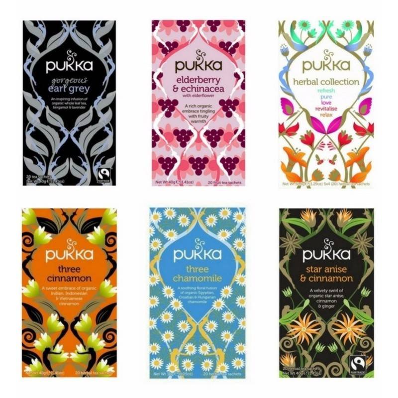
Now onto colour. Pukka are known for their intricate details on pack to emphasise the heritage of their flavours. This certainly stands out on shelf against their competitors. The use of patterns instead of block colour grabs your attention and clearly shows that the reason you should pick them up is taste. Whereas other tea brands focus on tradition – Pukka are all about the flavour!
We asked one of our team their thoughts on the packaging below..
Answer: “I love the infusion of colours, it’s somewhat mesmerising to look at! I can imagine this wouldn’t be everyone’s cup of tea though (ba-dum-ch)”
When we redesigned Great Food’s range we wanted to really emphasise how great the product tasted and created a design that is bold, impactful and proves Great Food is ‘Braver with Flavour’! You can see below the effect colour and bold type makes comparing the old and new designs.
We asked one of our team their thoughts on the packaging below..
Answer: “Great Food automatically shouts “tasty” to me and is full of impact. I would definitely pick this up on shelf to read more.”
In conclusion, there is no right or wrong option. You should work out exactly what your brand stands for and how you want consumers to see this. If you do go with minimalist packaging you have to be sure that the product/brand can support this.
“Exceptional minimalist design often has a single feature that stands out above all else. In the food realm, this requires understanding of a brand’s unique value proposition (UVP). In other words, designers must understand why their customers typically choose their products, and make this concept the focal point of their design.”
The opportunity you have with both is to be clear to the consumer, whether that’s through bold type, colour, highlighting the USP or flavour differentiation.
Which type of packaging do you prefer? Let us know below.
When designing packing, it is important to not just make sure it looks good on it’s own, but also when set against your competitors. That’s why at Slice, we regularly look at shelf shots for our clients as it’s important to envisage how the final pack will work at shelf.
Below we’ve collated our top 5 tips to ensure shelf standout. Enjoy!
1. Utilise your packaging
Think ahead to when the pack will be on shelf, how will it look with the rest of the range? Techniques such as shelf blocking through the use of strong brand colours and details, creates a compelling visual to lure consumers towards the brand to discover more.
Boddingtons have ensured a compelling identity on shelf by using the B (and bee) on their outer packaging (as long as people stack it the right way)
Alpen are also a brand who make sure they make their mark on shelf due to their letters joining up from the n to the A. When stacked next to each other there is a fluidity across packs, making the brand name stand out very well – great for instant recognition amongst shoppers.
2. Dare to be different
Now this could be a scary one to some people, but sometimes it pays off to be different. It’s a chance to disrupt the shelf through either colour, imagery or specific print techniques.
If this is too risky for you, why not try dipping your toe into the water with a limited edition pack and see how the reaction to it is?
Take Kleenex for example who come out with bold new editions that really make an impact. Oxo also make a statement by using letters across their packs to spell out their brand name on shelf. Certainly grabs the eye of a shopper!
3. Be clear on shelf
When a customer is looking for products, the last thing they want to be doing is having to search the pack for claims or benefits – especially in a supermarket. Having these clearly displayed on the front of pack or SRP makes it simple for the customer to know exactly what they are getting and they are therefore much more likely to pick up your product.
We’re not saying load the front of pack full of claims – as no-one has the time to go through that! Be selective and pick the best attributes of your product to emphasise.
Take Cilit Bang for example, when we designed their pack we created icons so it would clearly and concisely explain the use of the product. Clover also display the benefits of each of their products on the corresponding SRP – making for easy navigation per range.
4. Be smart
Don’t be single minded when it comes to pack design. What else could you do with it?
Is there an opportunity to also educate your consumer as we did for Aquafresh? Through iconography, simple and effective brand architecture and navigation, educating and guiding the consumer to purchase and beyond, ensures quick decision making and trust in simplicity.
Could the packaging be multi functional and turn into something else after you’ve used it, maybe to aid the product?
Or could it be environmentally friendly to backup your brand proposition? Enabling your packaging to take up less space or perform better through the use of less, is an aspect that is continuously becoming of concern and importance for consumers.
Duracell have been very clever with their point of sale in ensuring they utilise their brand equity. There’s no mistaking what that is!
5. Don’t forget shelf ready packaging & POS
And lastly, do not forget SRP’s and POS! This is very important as sometimes it’s an afterthought, taking a back seat to pack design. Once your product is on shelf, it’s main purpose is to sell and your product will only sell if people pick it up. An SRP can display information that isn’t on the front of pack or claims that you want to shout about.
Take Fairy as an example who use SRP to their advantage. Compared to their competition, they clearly stand out from afar by communicating value.
In order to utilise the shopper marketing channel appropriately, it is vital to ensure that brand equity is emphasised and strengthened through these channels, which can also create a brand world environment for consumers to experience.
If you really want to make an impression, make full use of your POS. Be as creative as possible and have some fun! Walls, Nutella, Listerine and Colgate are great examples of brands who use their POS to their fullest potential to get people talking!
If you have any other tips for shelf standout or brands that always catch your eye in the supermarket, we’d love to hear about it – so leave us a comment below.
Images courtesy of Toucan, Alamy Stock photo and DBA Design Effectiveness Awards
A brand’s logo is an integral part of any business so when you’ve made the decision to rebrand your logo, naturally you want people talking about it. However, what happens when all that chit chat about redesigns is negative?
Today we will be looking at 5 brands redesigns that caused very controversial opinions with the public when they revealed their new logo. All new logos are on the right.
You can’t please everyone with redesigns!
1. Uber redesigns logo
First up is Uber who released their new logo without their infamous “U.”
Peoples main concerns were not being able to find the app quickly on their phone when flicking through pages of apps as it’s no longer instantly recognisable.
In its press release regarding the update, Uber argued “Uber no longer moves just people; we’re now moving food, goods, and soon maybe much more. With the potential for many apps with many app icons, we needed one approach that connected them all. So we came back to our story of bits and atoms.”
However, it’s not all negative. One of our team members here are Slice thoughts:
“I personally like the new logo. It’s an abstract icon that pinpoints your destination – exactly what you want from Uber.”
2. Airbnb redesigns logo
When Airbnb released their new logo in 2014, they took took some serious backlash from the public – with many commenting on the similarity to Automation Anywhere’s logo. Others simply didn’t understand what the symbol was meant to be with multiple memes created of other (ruder) meanings.
In their post regarding the update Airbnb state: “Belonging has always been a fundamental driver of humankind. So to represent that feeling, we’ve created a symbol for us as a community. It’s an iconic mark for our windows, our doors, and our shared values. It’s a symbol that, like us, can belong wherever it happens to be.”
We at Slice are glad the old logo is gone. It reminded us of WordArt you chose for your year 8 homework!
3. BP redesigns logo
In 2000, BP undertook a $200m rebrand in an effort to showcase and highlight their green credentials to the public. The famous shield was replaced with a much friendlier and brighter flower shape.
Unfortunately the new logo was met with numerous parodies – most famously Greenpeace who ran a competition for a more appropriate logo. Oh dear!
4. Gap redesigns logo
For 20 years, Gap’s logo has been the unmistakable white writing in the blue box. In 2000, they decided to shake things up and release a brand new logo. The new logo received heavy criticism and complaints especially on social media. On Facebook in particular there were more than 2000 complaints demanding the old logo back. Whoops!
Gap listened..
Marka Hansen, president of Gap Brand North America posted this on the company website a week later.
“We’ve been listening to and watching all of the comments this past week. We heard them say over and over again they are passionate about our blue box logo, and they want it back.So we’ve made the decision to do just that – we will bring it back across all channels.”
This may be one you missed as it was only out for 1 week!
5. London 2012 Olympics redesigns logo
Now, this isn’t a redesign but it is a certainly still a logo that backfired. The London 2012 Olympics logo’s aim was to tap into the youth market. Unfortunately, they hated it. A study reported 70% of 11- to 20-year-olds disliked the logo. 68% of respondents reported they “hated” the design, with more than half saying this was due to it not saying anything about London or the UK.
Rawsthorn on Instagram comments: ”I felt then – and still feel now – that the 2012 logo was memorable for the wrong reasons, because it looked to garish with its clumsy typography and garish shapes”
How they handled the criticism?
Ije Nwokorie, managing director at Wolff Olins who designed the logo states: “Interestingly, the critical reviews tend to point out the rules we’ve broken, and in that sense they tend to be correct; the only disagreement is whether those rules need to be broken.”
Based in London UK, Slice Design are a top international creative branding and packaging design agency that have helped consumer brands grow and get noticed since 2004. We like to think of ourselves as a challenger to the large agency. As the name suggests we cut through jargon with our flexible, no nonsense approach and down to earth attitude. You can see some of our recent packaging design work here.
What are your thoughts on the redesigns above? Do you think it’s right they all received such heavy criticism. You have to hand it to Gap for listening to their customers and reverting back to the old logo. I can’t imagine how painful that process must have been!
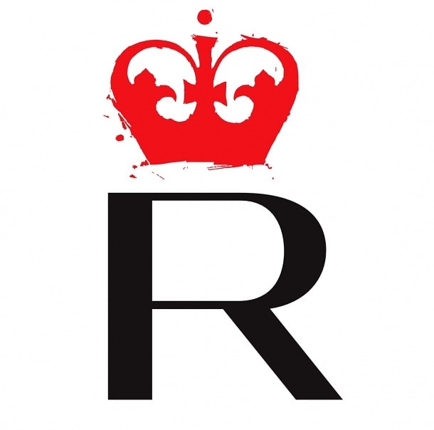
We’ve cropped, removed text and shown you snippets of logos below for you to guess. Having a logo that is still instantly known even though it’s not in it’s full form is proof it’s done it’s job.
Give the quiz a go and let us know your score.Good luck!
Based in London UK, Slice Design are a top international creative branding and packaging design agency that have helped consumer brands grow and get noticed since 2004. We like to think of ourselves as a challenger to the large agency. As the name suggests we cut through jargon with our flexible, no nonsense approach and down to earth attitude. Take a look at some of out latest packaging design work here